Custom Color

Custom Color

The custom coloration of Level designs is our most commonly requested service. It affords you unmatched flexibility to coordinate the colors of your mural with your space and is a cost-effective way of creating a one-of-a-kind mural installation.

When specifying custom colors, there are a few guidelines to consider which contribute toward a pain-free process and a successful result:

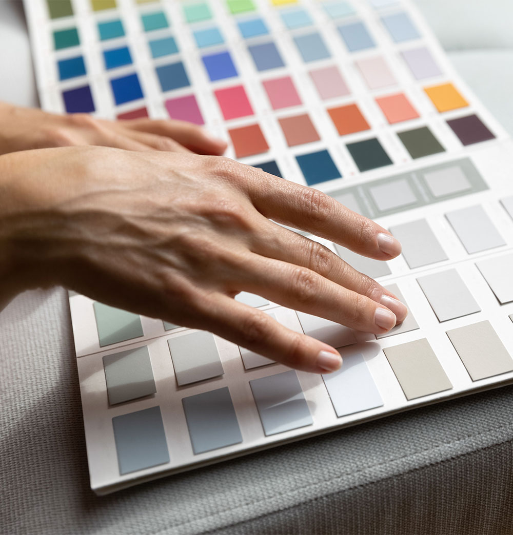
level-colors-page-header-photo

Selecting Custom Colors

Custom color references can come from a variety of sources ranging from paint chips and fabric swatches to flooring tiles and wood veneers, and everything in between. While many of these are all acceptable forms of reference material, they are not all equal in terms of efficiency and cost-effectiveness.

There are several forms of color reference that are preferable to the rest, and we refer to these as Level-Safe Colors. Because they are integrated into our printer’s calibration settings, when used as the target colors Level-Safe Colors can significantly increase the likelihood of a stronger match (in some cases a 90-100% color match). Likewise, Level-Safe Colors are a faster and more efficient way to customize color than using other forms of reference.

There are several commonly available color sets that qualify as Level-Safe Colors:

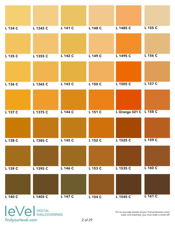
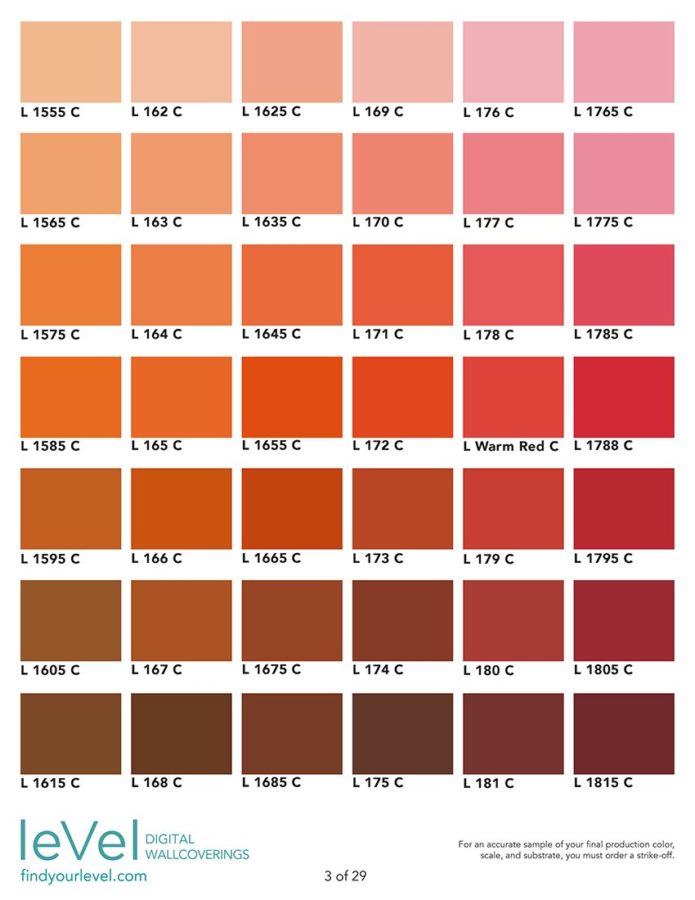
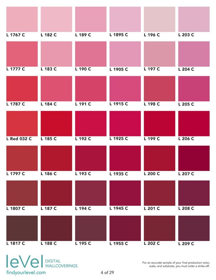
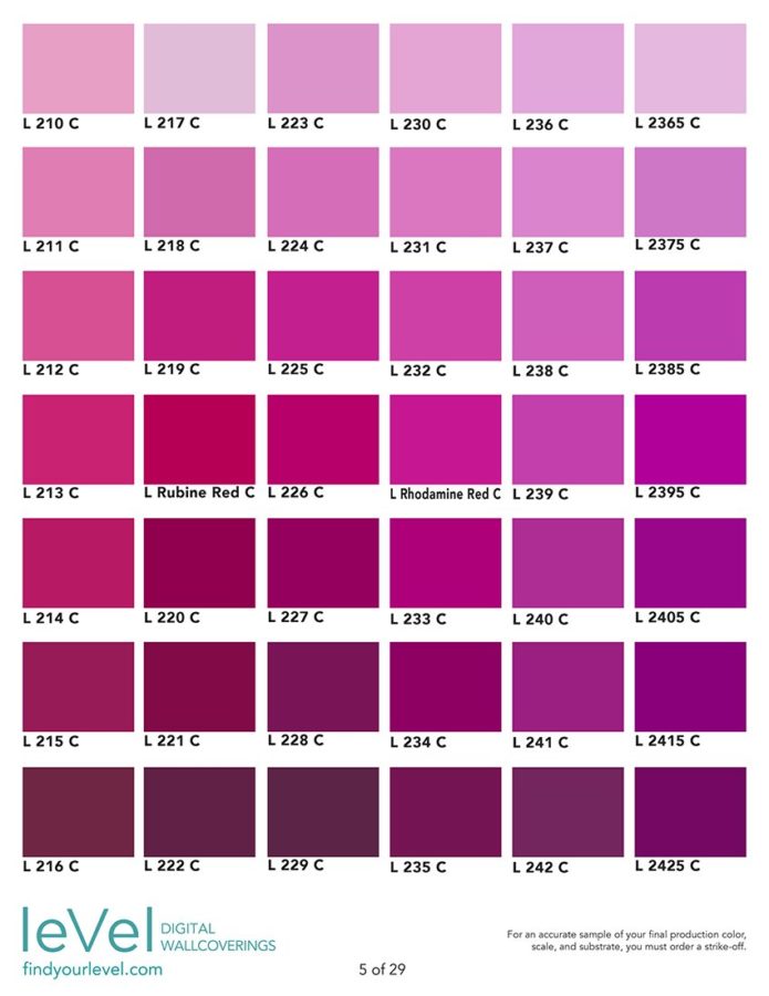
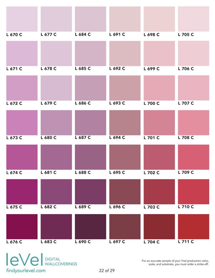
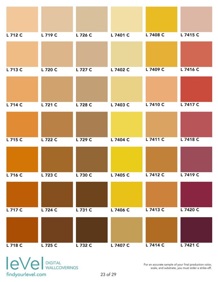
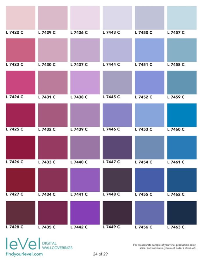
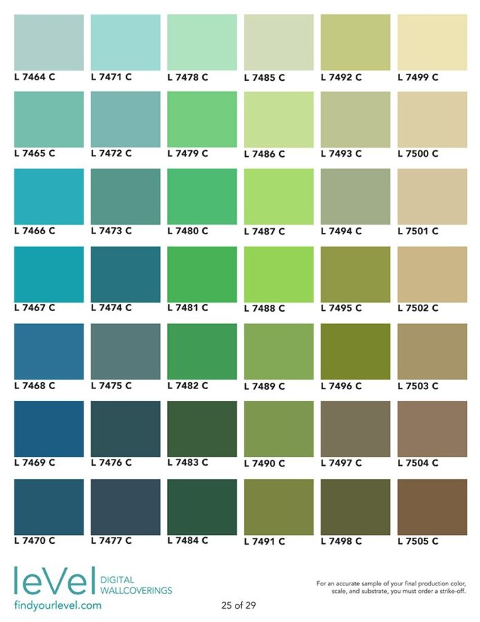
  • Our own Level Color Book (See below for more information)
  • A widely-used, premier graphic color matching system
  • Color from two of the most popular commercial paint brands

Ask your Level sales representative for specific information regarding these color sets.

level-specify-colors

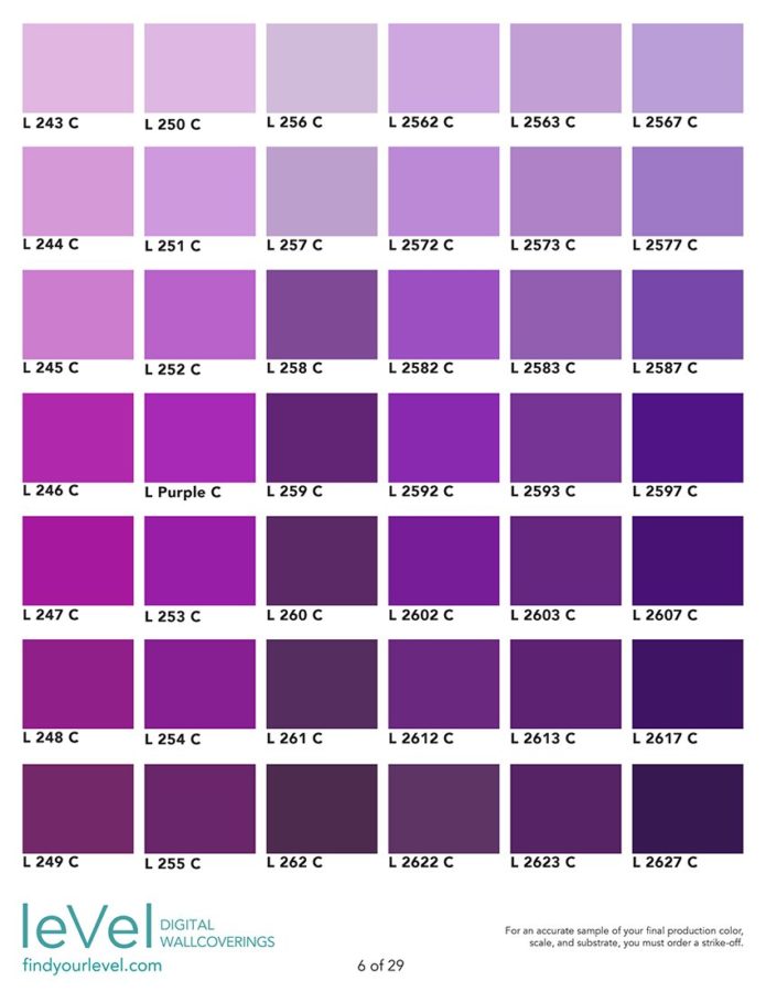
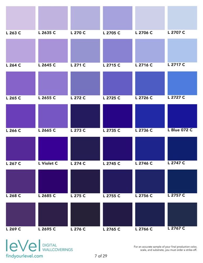
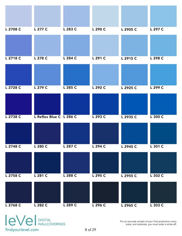
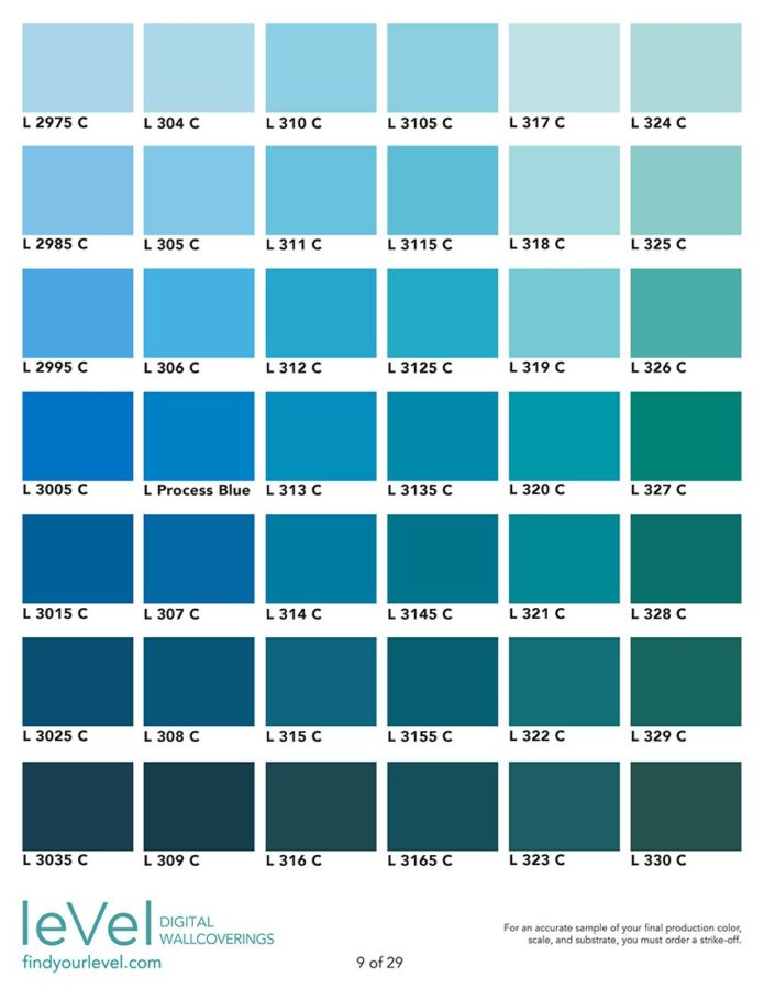
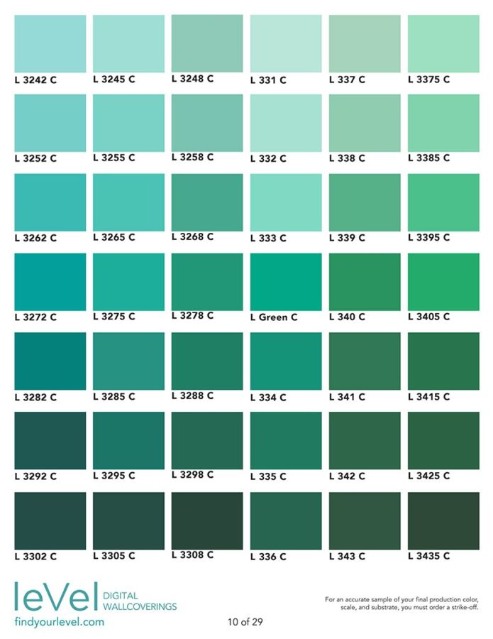
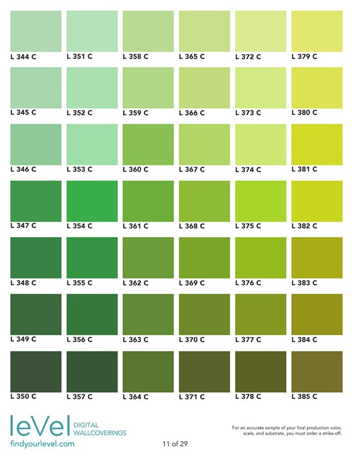
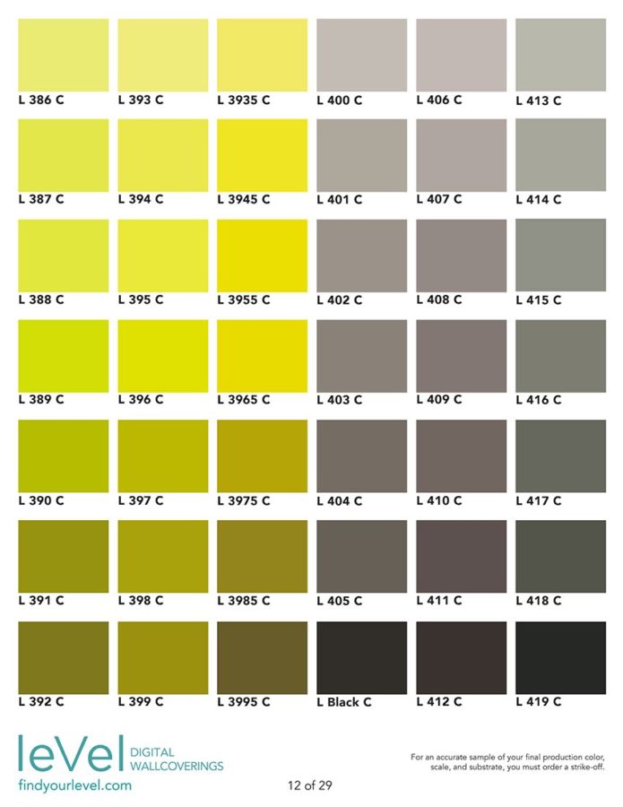
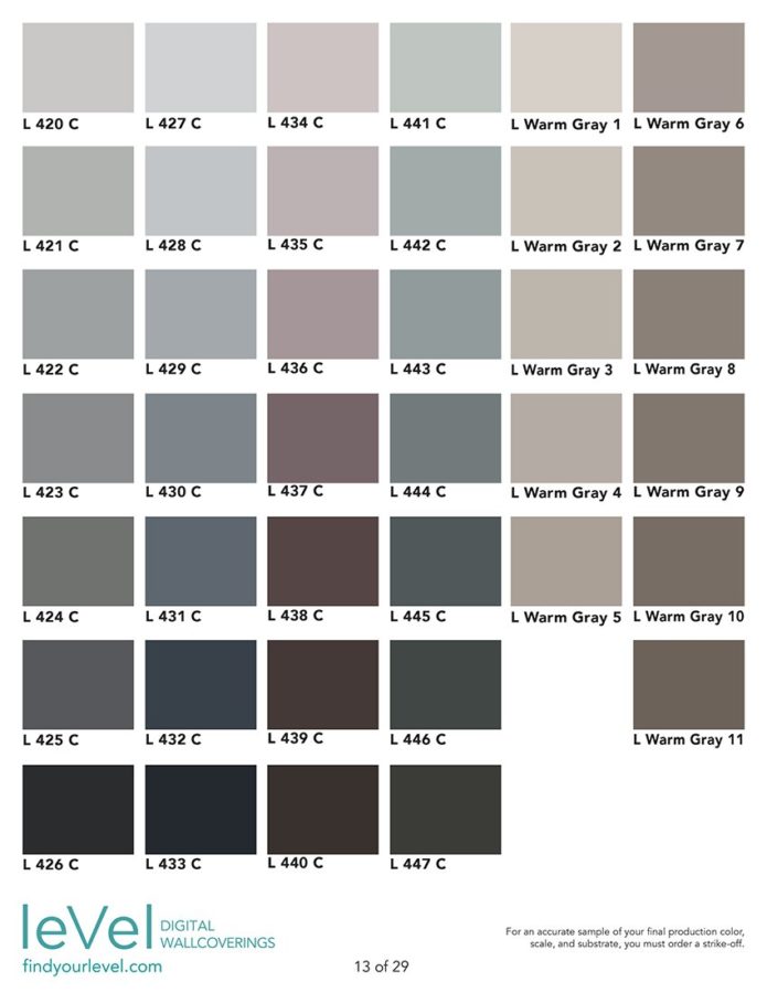
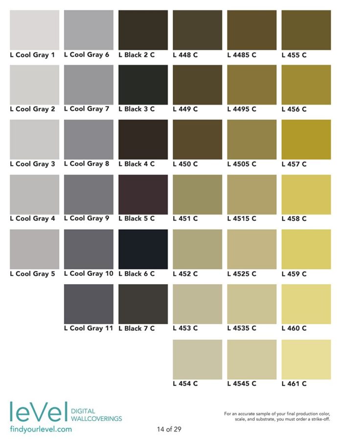
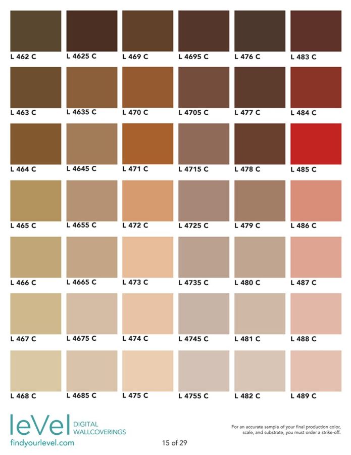
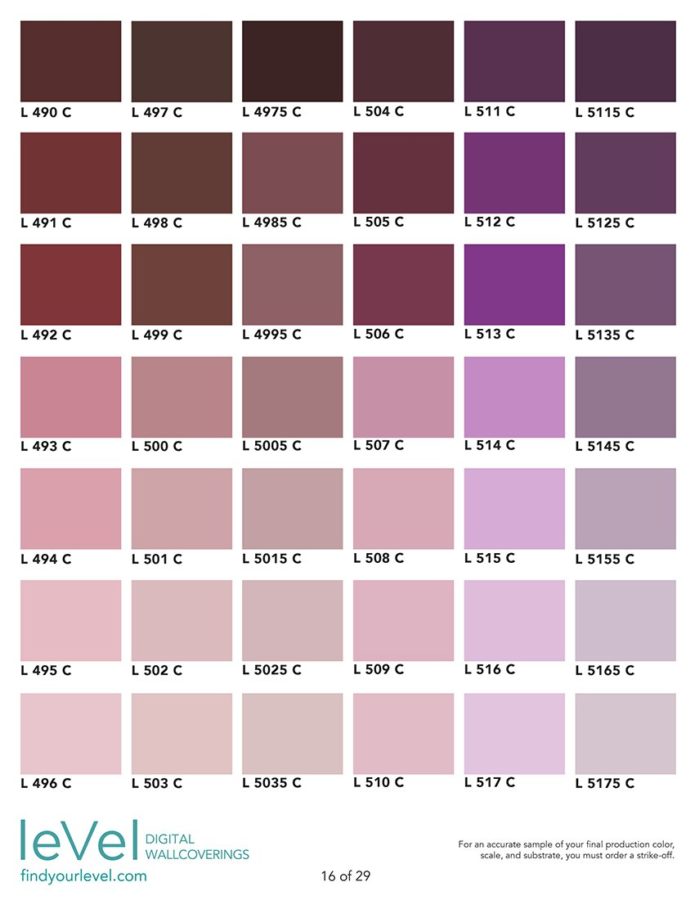
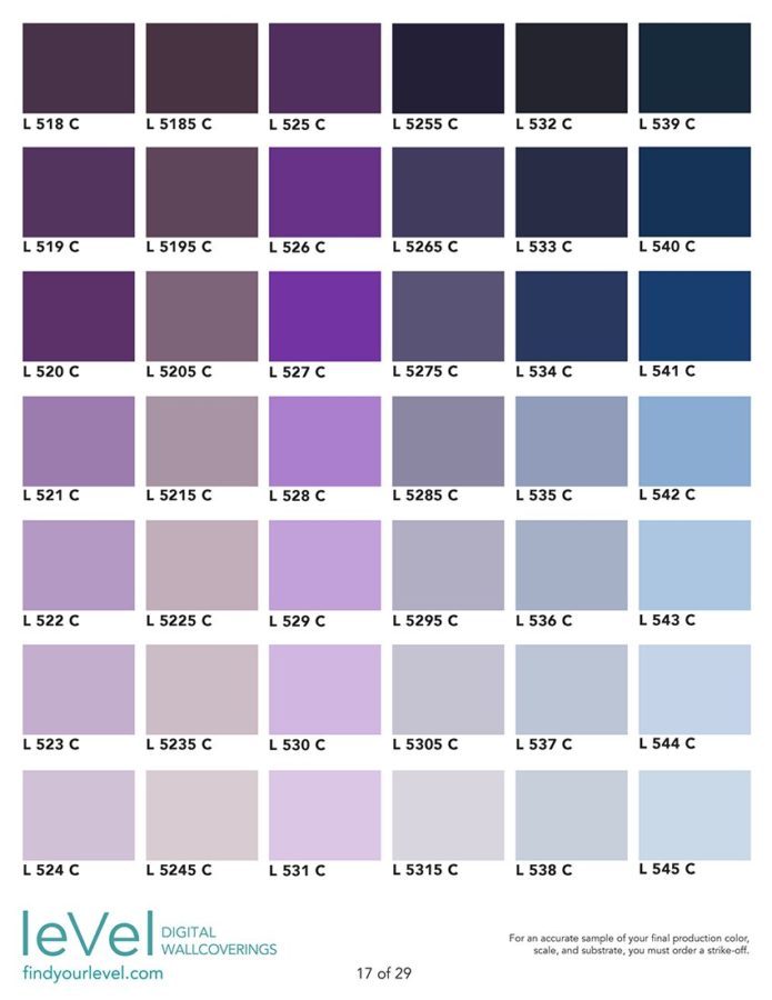
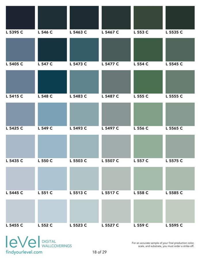
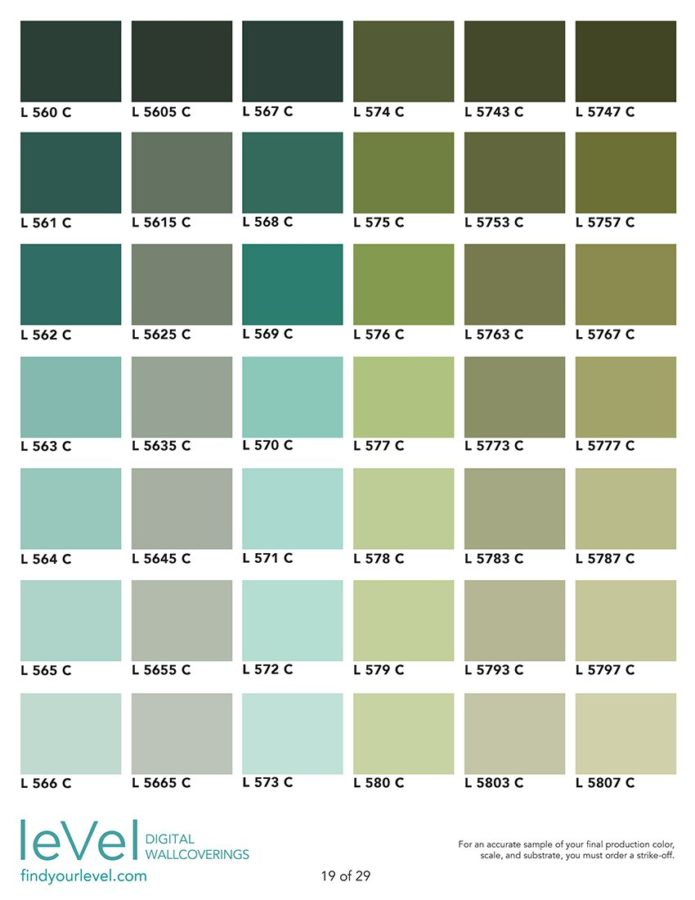
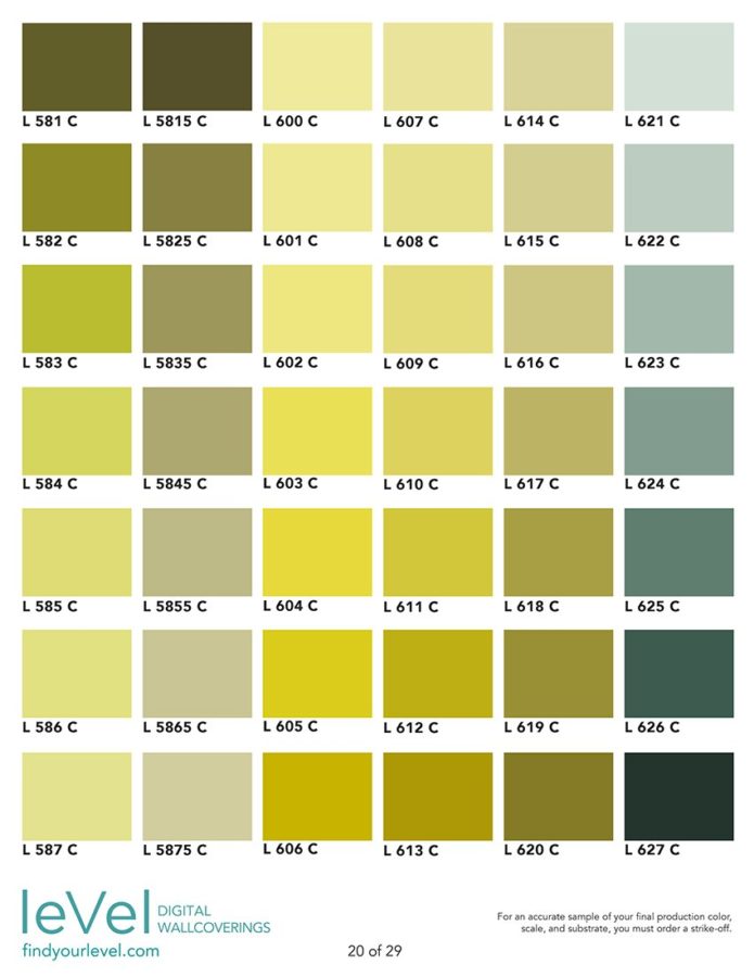
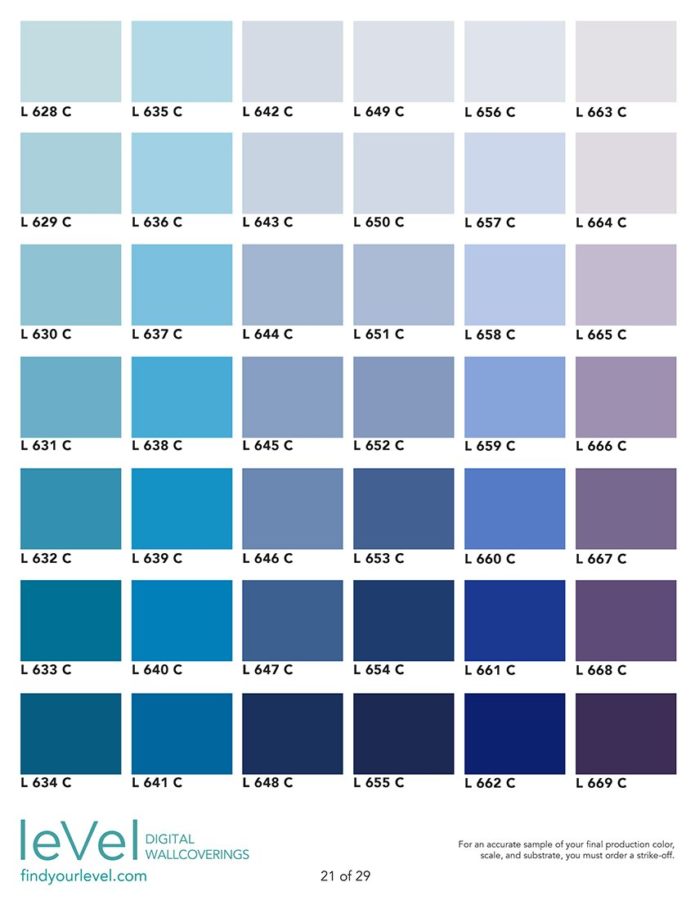
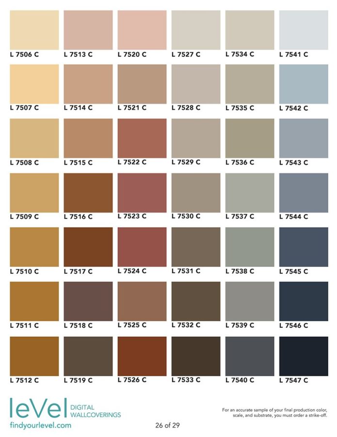
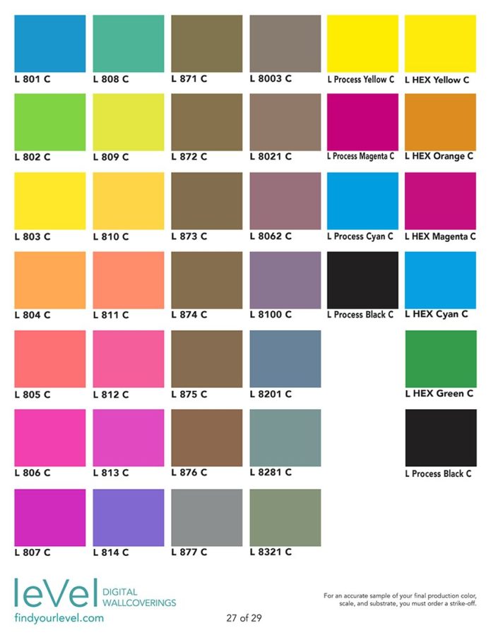
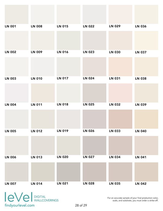
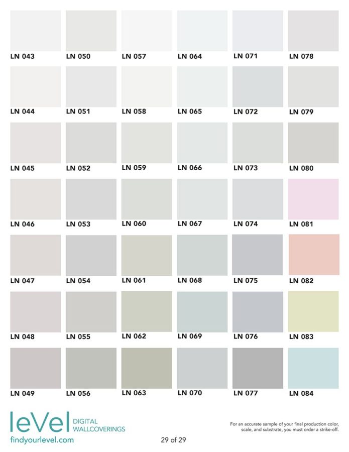
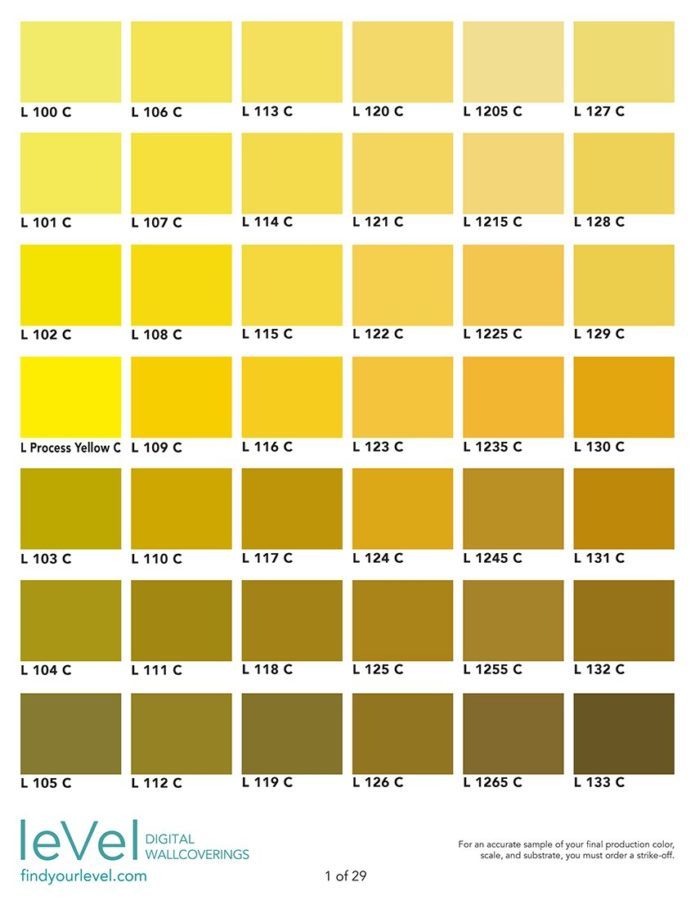
View the Level Color Book

To use this book:

  • Browse the individual pages below to determine which page or pages contain the approximate color you are looking for.
  • Ask your sales representative to review the actual prints of those pages with you.
  • Make your final selection(s) from the actual printed page(s).

Please Note:

Due to individual computer monitor and printer limitations, we do not recommend making your final color selections from the digital swatches on this page, nor any printouts of color from this page. For an accurate sample of our colors, you must request official pages of the Level Color Book from your sales representative!

Various artistic effects inherent in some designs, as well as your final choice of substrate, can alter the way custom colors appear when printed. And due to individual computer monitor and printer limitations, colors seen on digital mockups may not accurately reflect actual printed colors. For an accurate sample of your custom color you must order a Strike-Off.

Level color tolerances meet or exceed generally accepted digital print industry standards. The Level production staff makes every attempt to achieve the colors that you request as closely as possible within the current limitations of technology. Level inspects all finished product under specific color-correct lighting conditions (Daylight, 5000 degrees Kelvin, D50 bulbs).

Each Level design is designated as featuring either solid or tonal colors (see individual design pages). Solid Color designs feature relatively solid, opaque colors, which lend themselves to customization, so custom colors will therefore mostly reproduce as expected. Tonal Color designs primarily feature colors that are textured, layered, transparent, or tonal in nature. As a result, custom colors will likely not reproduce as a 100% match to a solid color reference swatch. Ask your sales representative for more information.

Other Considerations

  • Because of the tonal nature of so many of our designs, matching custom colors is not an exact science. Any given color may have tonal variations throughout a design, and it may also blend with overlapping colors which in turn affect its appearance.
  • Likewise printing the same colors on different materials can yield different results. Obviously, the same color printed on our Type II Textured White Vinyl will certainly look different than the same color printed on our Type II Smooth Silver Vinyl. However, even white substrates can vary from a very clean, cool white, to a warmer, softer, slightly off-white (the “white point” of the material). While they all appear to be white, these subtle differences can alter the appearance of printed color.
  • Moreover, different lighting conditions between the installation environment, our production facility, a designer’s office, etc., will cause light to reflect differently off of the same color. This can also affect the way colors appear from one space to another.
  • Even our own perception of color can be wildly subjective (remember this dress?).
  • With this in mind, it’s important to set your expectations properly. We do everything we can – using the best digital technology in the industry – to achieve your requested colors, but the results can vary widely.

There are several forms of color reference that are preferable to the rest, and we refer to these as Level-Safe Colors. Because they are integrated into our printer’s calibration settings, when used as the target colors Level-Safe Colors can significantly increase the likelihood of a stronger match (in some cases a 90-100% color match). Likewise, Level-Safe Colors are a faster and more efficient way to customize color than using other forms of reference.

There are several commonly available color sets that qualify as Level-Safe Colors:

  • Our own Level Color Book (See above for more information)
  • A widely-used, premier graphic color matching system
  • Color from two of the most popular commercial paint brands

Ask your Level sales representative for specific information regarding these color sets.